Evaluation
In what ways does your media product use, develop or challenge forms and conventions of real media products?
My media product both challenges and develops the conventions of other music magazines. Like many similar magazines i have a traditional masthead, for example in the music magazine Kerrang, their masthead is placed in the top of the magazine being both bold and recognisable. Mine however has challenged the traditional theme and is not spread completely over the page and my masthead is almost blending and merging With the rest of the cover. Most music magazines have headers and footers informing the audience of the topics and items included within the magazine in mine, i thought i should keep it simple and focus the front page on the band I was doing my 2 page article on. Also the way in which I used colours and script shows the social group representation. I have used the fonts to represent the social group the product is aimed at like many other music magazines; examples of magazines that implement this are kerrang and nme magazines. A more rock, scremo, grunge, indie based magazine. This music magazine in ways is very anti mainstream and doesn’t really attract the wider audiences that focus on more cultural music. For example the magazine vibe concentrates on a more rap and rnb based music including artists like eminem and 50 cent in ways this magazine doesn’t attract or cater for any other music preferences. Most magazines cater for a select genre of music and that’s what I incorporated into mine. Using images relevant to the genre of music within my product.
How does your media product represent particular social groups?
My media product in my opinion really represents a more closed social group, to people with a mixture of alternative music tastes like scremo, metal, rock, and grunge and indie persuasion. I didn’t want to attract an individual social group whom would only be interested in one style of music because in a marketing business this would restrict the target audience.
The social group is shown through the colours and editing through out the product which would meet there expectations of a music magazine.
Maybe People interested in going to gigs and festivals, finding out information about their favourite artist or band. The people on the cover represent people from a mixed background, with their clothes and their poses. This magazine however does not really appeal to people interested in rnb or rap genres of music. The magazines colours and layout show a more rock orientated magazine and the bands and headline placed the way they have been show the influences behind them.
What kind of media institution might distribute your media product and why?
The kind of institution that would distribute my media product is more of the rock music variety publishers. Kerrang is published by Bauer consumer media in the uk, my magazine would be aimed at there market and as my product/magazine is similarly styled to there’s, but including a more alternative and underground music may attract them to publish my product. If this wasn’t a possibility I would then try and get published by a more independent market or publisher. An example of this would be maybe getting a double page spread incorporated into the reading chronicle newspaper, therefore developing and widening their audiences and allowing my product to spread.
There’s a wide range of stores which would distribute my media product such as supermarkets, record stores and newsagents. For example in a record store a customer could be purchasing a different media product and will then notice my product in the same section which would catch there attention, for example if someone from my target audience was shopping in a place like HMV were a large number of my target audience is based around, they would go in to purchase a cd or game and notice my magazine, this would then help them to recognise and purchase the magazine.
Supermarkets would distribute my product as they aim to please all costumers with there items, my media product would achieve this in an entertainment section.
Who would be the audience for your media product?
The audience that would be suited and that my product is aimed for would be people around the age of fifteen to twenty years old. Probably people in schools or colleges. Readers from the same market as magazines such as kerrang and nme. This is a very attractive audience and there are many products aimed towards them, however with the unique style of mine I feel that it would become popular quite quickly. People into a more underground style of music (rock-indie-scremo-death metal, death core, trip hop, techno) would prefer and relate to this magazine.
As I was carrying out my media product I also took into account making it attractive to both male and females by using bold colours such as greens and white, the inclusion of both male and female people through the magazine would also appeal to both sexes.
How did you attract/address your audience?
In my opinion I used my texts and fonts to attract the audience and not make it too hard for them to read. The pictures and images I incorporated I feel gave it a feeling of continuity and the techniques and layout didn’t make it too crowded and confusing for the audience.
(I used my finished product and gathered together a group of media students doing the print sector of the course and asked them evaluate my finished product this is what I found out- I also asked some people outside of 6th from to see what their opinions were)
Rebecca- I like the way the pictures are very clear and colourful, the front cover is very attractive and I like the way it hasn’t been overcrowded. The 2-page article is good but I think more could be added, maybe more text. The contents page is the only place however I think you have struggled, the white space could be covered up but I think it looks good in white and is still clear.
Lyn- at first instance I think the font cover is very good, but maybe if more was included it may attract more attention, the colours and pictures though do still attract me, as they aren’t dark or fuzzy like most magazine covers. The contents page is god but the layout could be improved. But I like the structure within it. I have no complaints with your 2-page article, its clear and attractive and the content is very good.
Tina ruigwa- background works well with the band picture. Good colour coordination Not to cluttered. Nice. Think picture in bottom left could be less close and maybe retook. Good layout and techniques. Like the feathering around the pictures. Good incorporation of pictures and techniques using Photoshop. Good layout. Images work well and a good flow throughout magazine.
Dale Stewart – I like the way that you’ve used different editing and camera techniques to really create a unique look. The colour and text also flow throughout the product and I think it looks really cool. On your contents page however you could’ve laid it out a bit differently it looks a bit bland in my opinion maybe tried to implement a background into it. But overall I think its amazing.
Christian Mitchell- I like the front cover a lot, the way the picture really blends with the background is really cool. I like the way its not to filled, the way its quite simple of it makes it attractive and the whole page really stands out. The contents page I also liked, the layout could have been changed a little bit in my opinion maybe just flip the two sides over if you know what I mean. The article is awesome, the colours and feathering used worked really well, the content is also really good. Nice one jonny
What have you learnt about technologies from the process of constructing this product?
That there are many tools and techniques that are available to you in creating any media product from print to radio to film are very extensive. I learned a lot through creating my media product.
I am now able to developed and manipulate images, edit them in a number of ways, changing fonts, size, and backgrounds.
I can now crop and transfer images to different documents and edit them to fade or blend in with other items.
Through Photoshop I am now sufficiently able to layer and create a range of different products, add pictures, text, even sound if necessary.
I have also become quite skilled at photography taking many pictures towards my final product, from going to gigs and taking live photo’s and also taking posed pictures in a controlled environment, afterwards I can add effects and manipulate them into nearly any programme of my choice.
Looking back at your preliminary task, what do you feel you have learnt in the progression from it to the full product?
I have defiantly improved my entire range of ict skills; I hadn’t used Photoshop before so this was all new to me but looking back to my preliminary task I can see how much I have improved. The preliminary task in my opinion was too bland and stiff; there wasn’t any real manipulation or editing done within the page. Everything was laid out to simply and there was no different in text. In my final product however I have layered and manipulated many images, I have also used different font’s ands text sizes to create different feelings and sections within the magazine. Through the use of Photoshop I have used its tools to feather and layer images together to create a whole new image and used layering to help the eye flow through the page. I have learned that a lot of preliminary work is necessary to actually create a final product. Research into the area that you producing for and relevant input from the audience your products aimed at really helps to know what to be included within the product.
Friday 8 May 2009
Wednesday 29 April 2009


final school magzine

this is my finished school magazine cover
that i created through the tool photoshop.
ysing the researcha and techniques that i have learned.
school magazine deconstruction and evaluation
studentsSchool magazine examples
 Masthead well presented. Extenuates the schools name and draws the on lookers to the page.
Although the use of colour is good it may not be such a good attribute, as the use of vibrant colours may distract the reader.
Very positive representation on their students
The school logo is also very well presented and the composition of the page manages to include it nicely and manage to make it flow within the layout
The style of both the masthead and the lower print helps emphases the text and make it stand out more. It also helps attract people.
Also the background is very bright and eye-catching, the colours they use are very loud however this helps draw people in. the other colours in the page are also very vibrant and bold which gives the whole page a good flow and positive attitude.
Also the background is very bright and eye-catching, the colours they use are very loud however this helps draw people in. the other colours in the page are also very vibrant and bold which gives the whole page a good flow and positive attitude.

Nice big, bold simple head mast.
Stands out.
Stands out.
Nice, moderrn, colourfuly, imaginative display.
However they include a lot of information which may distract or hinder someone from wanting to read it.
However they include a lot of information which may distract or hinder someone from wanting to read it.
I like the way the magazine cover includes the school, pictures of some of the students which I think portrays a good mixture of different people and shows the place to be a fun, interesting place. This factor may influence people into reading the brochure/magazine or think about attending a school or college.

At first instance the cover is very intricate and eye-catching.
The blending and use of many different colours is used well to make the page flow from top to bottom.
The blending and use of many different colours is used well to make the page flow from top to bottom.
The mast head and underline text is clear and well laid out. Its
Also the different sub heading are used well, they give information about what is included in the magazine and the important issues within.
Also the different sub heading are used well, they give information about what is included in the magazine and the important issues within.
The magazine clearly has its own unique style and I think it gives the magazine a very positive feeling or look. The style of the cover is very imaginative original and attractive and modern.
Some criticism could be that the actual layout is too simple and more may be needed.
Also people may argue that the colour could distract the reader instead of attract.
Also people may argue that the colour could distract the reader instead of attract.
how to use photoshop?- casting notes and location- school magazine
How to use adobe Photoshop
These are a few links in order to give you a good idea and understanding of the program adobe Photoshop and some tips and tricks to help. Adobe Photoshop is a program to edit, change and create different sorts of media.
www.graphicsacademy.com/software_adobe_photoshop.php.com
www.photoshopsupport.com/tutorials.html
www.lbis.kenyon.edu/helpline/software/adobephotoshopelements.com
Adobe Photoshop, or simply Photoshop, is a graphics editing program developed and published by Adobe Systems. It is the current and primary market leader for commercial bitmap and image manipulation, and is the flagship product of Adobe Systems
Casting notes and location
I aim to take a picture of a group or single 6th form or year 11 student for the cover of my newspaper/school magazine. I will take the picture either in or outside the 6th from block as there is good lighting around the area. Outside in the mourning watching everyone entering the school or in the school grounds on the field or in front of a building or crowded area would show the activities and groupings of the students and if the picture will be taken outside I will try and introduce some lighting either by just using flash or up against a canvas or background.
The students I will probably use are;
Daniel Ashfield, dale Stewart, trey Dunbar, Joe taphouse, Ryan butler,
Tina rugiwa.
I think these people are good representatives for the schools as the are hardworking but still enjoy themselves and have fun. They dress smartly and I think these people will give the magazine/newspaper a good positive laid back feeling. I will be taking a good medium-close up group shot of the group or perhaps separate students. There maybe a possibility of some extras from year 11 to be decided and then included.
print-ideas and maintask
Print
Preliminary exercise; using desk top publishing and an image manipulation program, produce the front page of a new school/college magazine, featuring a photograph of a student in medium close up plus some appropriately laid out text and masthead. Additionally candidates must produce a mock up of the layout of the contents page to demonstrate their grasp of desk top publishing
Ideas
Masthead- from them- through us- to u
Slogan- we found it- we made it- you want it
Then picture of a group of students next to title in medium close-up
Write at least a 48 word statement to tell them wat its about, includes and headlines
Contents-
1. Little things
2. Recent news and issues
3. Outside the grounds-what’s going on
4. Interviews- beardy yes or no?
Main task
The front page, contents and double page spread of a new music magazine. All images and text used must be original. Minimum of four images
Include events about reading fest, new bands, recent news and interviews
Thursday 26 March 2009


Tuesday 24 March 2009
music mag - questionnaire


these are the music magazines that i have studied dedconstructed conducted focus groups for and based mywork and research on.
thiese are the questions that i out forward to find out what people expected froma music magazine.
How old are you?
15-17
18-20
20-30
Are you male / female?
male
female
What music genre are you into?
Classic/
country
R.n.b
Punk/rock/
new rock
grunge
scremo
dance
rap
Techno/rave
All
What magazine do you buy/read?
kerrang
Metal hammer
Top of the pops
Smash hits
I love stars
spin
revolver
Q
Other please state
•How often do you buy a magazine per month?
•1-2
•3-4
•5-6
•more
How much money are you willing to pay for a magazine?
•£2 - £3
•£3 - £4
•More
•Do you expect posters, stickers, and extra bits inside a magazine?
•yes
•no
Do you expect specific reviews, and interviews with artists ect?
•
•yes
•no
Does the cover make you want to read it?
•
•yes
•no
Do u like a lot of information on the cover.
•
•yes
•no
These are the results from using my questionnaire i found out peoplepreffered or liked from a music magazine.
How old are you?
15-17
16
18-20
0
20-30
1
male or female?
male
11
female
6
what music genre do you like
Classic
0
Rnb
4
rock
6
grunge
0
scremo
1
dance
1
rap
0
techno
1
other
4
which magazine do you buy/read
kerrang
6
metal hammer
1
top of the pops
2
smash hits
2
I love stars
0
spin
0
revolver
1
q
3
nme
3
6
metal hammer
1
top of the pops
2
smash hits
2
I love stars
0
spin
0
revolver
1
q
3
nme
3
how often do you buy a magazine every month
1 to 2
14
3 to 4
3
5+
0
how much money are you willing to pay for a magazine
£2-£3
9
£3-£4
9
more
1
so you expect posters,stckers, and extra items within the magzine
yes
14
no
4
do you expect specific reveiws,interviews and artists included
yes
16
no
1
does the cover make you wish to read the magazine
yes
17
no
0
do you like a lot of information on the cover
yes
16
no
1
Deconstruction of magazines
haii again. in this blog i have included my deconstruction of magazines. i have studies and looked at three different magazine covers as you know. i have them taken them apart and reviewed the good and bad points about the magazine, and what they inclcuded.
 This magazine is from Kerrang
Clear, attractive main cover, this attracts the customer, the friendly cover helps invite the reader also the use of bright and vibrant colours also have a massive impact and persuades the audiences to purchase the magazineThe extras included and free gifts included and are a good selling point for the magazine. For example in this issue there are free posters this helps persuade the reader to buy the magazine and is something good for weekly fans to collect
The way in which the text and pictures are presented allow the page to flow and the readers eye to follow the page down.
A criticism of this magazine could be that it’s too cluttered, that too much is occurring within the cover and may distract or disorientate the reader.
Also another criticism would be that it only focuses on one specific grouping of music, and that’s mainly between the rock, indie and metal and does not include any other genres so r`n`b rap ect and therefore would drive away potential
Footer informing the reader about some of the content within the magazine and the extra included within this issue
The overlapping of the picture and the text, makes the whole page stand out, creating a feel of realism, A more 3d effect, giving the image and the whole page a more dramatic impact and a feel of depth
Clear, big masthead- showing the title and name of the magazine along with their slogan “life is loud”
 This magazine cover is taken from VIBE
The header is used very effectively to inform the reader of what is included within the magazine and some issue that may be raised within the magazine
The main sub heading informs the reader of the main article inside this issue and would help to attract the reader if they were interested in the subject
Like many magazines this one focuses mainly on one area or group of music, vibe is a more r`n`b, rap orientated magazine and therefore only a select group of people are going to be attracted to it.
A criticism of this magazine could be that the plain and simple layout could not attract people to buy the magazine
The use of overlapping the picture and the text help give the page depth and makes it stand out more, drawing the reader in.
The plain and simple format could help attract the reader and enhance the impact of the writing and picture within the front page.
The masthead is bold and plain, this helps to make the writing stand out against the white background
The use of two very well known public faces in the rap n r`n`b scene would help sell this magazine as people are very interested in their lives and the things their involved with
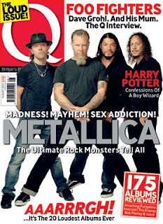 The last magazine that i deconstructed if from Q
The magazine also presents its slogan “the loud issue” which allows many people to associate it with the magazine helping to make it more popular.
The headmaster is attractive yet clear, the bright colour mixed with a white background really makes the text stand out dramatically.
A criticism of this magazine would be that the simplistic layout and design of the magazine would not be as attractive to the public and would therefore not sell as well as it should.
The magazine also implements the use of sub headings to give information to the viewer about the issues or content within the issue
The overlapping of the picture and text provides a sense of depth within the page and the composition allows the readers eye to flow through he page smoothly.
The front cover also includes information on the header, giving details of the content within the magazine.
Equiptment ** Casting ** production schedule
Equipment
Paper, pencil, rubber, ruler, sharpener for sketches
Internet and picture systems to locate and find pictures for use in magazines.
Macromedia fireworks and Photoshop to create magazines
Casting
Interview my friend’s band front man – zack for main article
Will be asking him question which I will then post in another blog ( waiting to hear back from him atm)
Get some news or proposed gossip and cover the reading festival 09
Information and news on bands i.e., blink 182 reformation, gigs, new up and coming bands.
Production schedule
All thumbnail designs for my magazine cover completed by –10 February = completed
Equipment and casting completed by – 11 February = completed
Article to be completed by – Friday the 13th = completed
Preliminary Work *-* Focus Group
For my preliminary work i included 3 different magazines which i also diconstructed to find out what was good or bad about them and or whats included within the magazine front cover( the deconstruction of magazines will be included later)
 This is the first cover i showed them. from the magazine Q.
7/10- plain background, the layout seems to be all over the place, unorganised composition. Didn’t like the way its was too simple
8/10- good content and layout
6/10- plain-bad composition-to bland
7/10- liked the way the red text and head mast made the magazine cover stand out. Also the way the colours complimented and worked well with one another
(Have to make sure all the colours I use don’t distract or ruin the cover. Make sure they compliment one another)

This is the second magzine from VIBE
5/10 – this magazine doesn’t include any other variations of music and doesn’t interest me
7/10 I like the way that the colours outline the main things included within the magazine and the way they compliment each other, I also like the text and composition they have used
6/10 good information given, explaining the content within, however could be colourful and include more images

8/10 good magazine, like the way it included free posters and the colours they use to really grab the reader eye
9/10 good music magazine always includes good offers and extra content, good information and layout on the front
for this focus group i showed students the magazine covers and asked them a series of question
what was good and bad about them
how they liked the use of colours and fonts ect
i also asked them to give it a rating out of 10
 This is the first cover i showed them. from the magazine Q.
7/10- plain background, the layout seems to be all over the place, unorganised composition. Didn’t like the way its was too simple
8/10- good content and layout
6/10- plain-bad composition-to bland
7/10- liked the way the red text and head mast made the magazine cover stand out. Also the way the colours complimented and worked well with one another
(Have to make sure all the colours I use don’t distract or ruin the cover. Make sure they compliment one another)

This is the second magzine from VIBE
8/10- my style of music, like the way eminem and 50 cent are portrayed as they are two of the most influential people within this genre of music
5/10 – this magazine doesn’t include any other variations of music and doesn’t interest me
7/10 I like the way that the colours outline the main things included within the magazine and the way they compliment each other, I also like the text and composition they have used
6/10 good information given, explaining the content within, however could be colourful and include more images

The last magazine that i showed the people envolved within the focus group was from Kerrang
10/10 – good composition and content- nice use of colours and editing techniques such as overlapping, like the way they include some of the content down the bottom and the footer
5/10 doesn’t really include much of other genres of music but a good bright cover which draws the eye
5/10 doesn’t really include much of other genres of music but a good bright cover which draws the eye
8/10 good magazine, like the way it included free posters and the colours they use to really grab the reader eye
9/10 good music magazine always includes good offers and extra content, good information and layout on the front
Friday 27 February 2009
My AS Media
haii
i am creating and using blog spot for my media coursework, im going to include my prep work and the final work comments will be nioce =]
i will probably use this at home now aswell lol
so updates and new productions and work will be uploaded.
i am creating and using blog spot for my media coursework, im going to include my prep work and the final work comments will be nioce =]
i will probably use this at home now aswell lol
so updates and new productions and work will be uploaded.
Subscribe to:
Posts (Atom)