Thursday 26 March 2009

research-graphs


Tuesday 24 March 2009

music mag - questionnaire


these are the music magazines that i have studied dedconstructed conducted focus groups for and based mywork and research on.
thiese are the questions that i out forward to find out what people expected froma music magazine.


How old are you?
15-17
18-20
20-30

Are you male / female?

male
female
What music genre are you into?

Classic/
country
R.n.b
Punk/rock/
new rock
grunge
scremo
dance
rap
Techno/rave
All

What magazine do you buy/read?

kerrang
Metal hammer
Top of the pops
Smash hits
I love stars
spin
revolver
Q
Other please state


•How often do you buy a magazine per month?

•1-2
•3-4
•5-6
•more

How much money are you willing to pay for a magazine?

•£2 - £3
•£3 - £4
•More

•Do you expect posters, stickers, and extra bits inside a magazine?

•yes
•no

Do you expect specific reviews, and interviews with artists ect?

•yes
•no

Does the cover make you want to read it?

•yes
•no

Do u like a lot of information on the cover.

•yes
•no
These are the results from using my questionnaire i found out peoplepreffered or liked from a music magazine.

How old are you?
15-17
16
18-20
0
20-30
1

male or female?

male
11
female
6

what music genre do you like

Classic
0
Rnb
4
rock
6
grunge
0
scremo
1
dance
1
rap
0
techno
1
other
4

which magazine do you buy/read
kerrang
6
metal hammer
1
top of the pops
2
smash hits
2
I love stars
0
spin
0
revolver
1
q
3
nme
3

how often do you buy a magazine every month

1 to 2
14
3 to 4
3
5+
0

how much money are you willing to pay for a magazine

£2-£3
9
£3-£4
9
more
1

so you expect posters,stckers, and extra items within the magzine

yes
14
no
4

do you expect specific reveiws,interviews and artists included

yes
16
no
1

does the cover make you wish to read the magazine

yes
17
no
0

do you like a lot of information on the cover

yes
16
no
1

Deconstruction of magazines

haii again. in this blog i have included my deconstruction of magazines. i have studies and looked at three different magazine covers as you know. i have them taken them apart and reviewed the good and bad points about the magazine, and what they inclcuded.


This magazine is from Kerrang
Clear, attractive main cover, this attracts the customer, the friendly cover helps invite the reader also the use of bright and vibrant colours also have a massive impact and persuades the audiences to purchase the magazineThe extras included and free gifts included and are a good selling point for the magazine. For example in this issue there are free posters this helps persuade the reader to buy the magazine and is something good for weekly fans to collect
The way in which the text and pictures are presented allow the page to flow and the readers eye to follow the page down.
A criticism of this magazine could be that it’s too cluttered, that too much is occurring within the cover and may distract or disorientate the reader.
Also another criticism would be that it only focuses on one specific grouping of music, and that’s mainly between the rock, indie and metal and does not include any other genres so r`n`b rap ect and therefore would drive away potential
Footer informing the reader about some of the content within the magazine and the extra included within this issue
The overlapping of the picture and the text, makes the whole page stand out, creating a feel of realism, A more 3d effect, giving the image and the whole page a more dramatic impact and a feel of depth
Clear, big masthead- showing the title and name of the magazine along with their slogan “life is loud”


This magazine cover is taken from VIBE
The header is used very effectively to inform the reader of what is included within the magazine and some issue that may be raised within the magazine
The main sub heading informs the reader of the main article inside this issue and would help to attract the reader if they were interested in the subject
Like many magazines this one focuses mainly on one area or group of music, vibe is a more r`n`b, rap orientated magazine and therefore only a select group of people are going to be attracted to it.
A criticism of this magazine could be that the plain and simple layout could not attract people to buy the magazine
The use of overlapping the picture and the text help give the page depth and makes it stand out more, drawing the reader in.
The plain and simple format could help attract the reader and enhance the impact of the writing and picture within the front page.
The masthead is bold and plain, this helps to make the writing stand out against the white background
The use of two very well known public faces in the rap n r`n`b scene would help sell this magazine as people are very interested in their lives and the things their involved with


The last magazine that i deconstructed if from Q
The magazine also presents its slogan “the loud issue” which allows many people to associate it with the magazine helping to make it more popular.
The headmaster is attractive yet clear, the bright colour mixed with a white background really makes the text stand out dramatically.
A criticism of this magazine would be that the simplistic layout and design of the magazine would not be as attractive to the public and would therefore not sell as well as it should.
The magazine also implements the use of sub headings to give information to the viewer about the issues or content within the issue
The overlapping of the picture and text provides a sense of depth within the page and the composition allows the readers eye to flow through he page smoothly.
The front cover also includes information on the header, giving details of the content within the magazine.

Equiptment ** Casting ** production schedule

Equipment

Paper, pencil, rubber, ruler, sharpener for sketches
Internet and picture systems to locate and find pictures for use in magazines.
Macromedia fireworks and Photoshop to create magazines


Casting

Interview my friend’s band front man – zack for main article
Will be asking him question which I will then post in another blog ( waiting to hear back from him atm)
Get some news or proposed gossip and cover the reading festival 09
Information and news on bands i.e., blink 182 reformation, gigs, new up and coming bands.

Production schedule

All thumbnail designs for my magazine cover completed by –10 February = completed

Equipment and casting completed by – 11 February = completed

Article to be completed by – Friday the 13th = completed

Preliminary Work *-* Focus Group

For my preliminary work i included 3 different magazines which i also diconstructed to find out what was good or bad about them and or whats included within the magazine front cover( the deconstruction of magazines will be included later)
for this focus group i showed students the magazine covers and asked them a series of question
what was good and bad about them
how they liked the use of colours and fonts ect
i also asked them to give it a rating out of 10

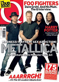
This is the first cover i showed them. from the magazine Q.

7/10- plain background, the layout seems to be all over the place, unorganised composition. Didn’t like the way its was too simple

8/10- good content and layout

6/10- plain-bad composition-to bland

7/10- liked the way the red text and head mast made the magazine cover stand out. Also the way the colours complimented and worked well with one another
(Have to make sure all the colours I use don’t distract or ruin the cover. Make sure they compliment one another)


This is the second magzine from VIBE

8/10- my style of music, like the way eminem and 50 cent are portrayed as they are two of the most influential people within this genre of music


5/10 – this magazine doesn’t include any other variations of music and doesn’t interest me


7/10 I like the way that the colours outline the main things included within the magazine and the way they compliment each other, I also like the text and composition they have used

6/10 good information given, explaining the content within, however could be colourful and include more images


The last magazine that i showed the people envolved within the focus group was from Kerrang


10/10 – good composition and content- nice use of colours and editing techniques such as overlapping, like the way they include some of the content down the bottom and the footer

5/10 doesn’t really include much of other genres of music but a good bright cover which draws the eye

8/10 good magazine, like the way it included free posters and the colours they use to really grab the reader eye

9/10 good music magazine always includes good offers and extra content, good information and layout on the front